CASE STUDY
Advocacy
An AI-supported companion app helping Black women prepare for and advocate during medical appointments.
Role
UX Researcher & Designer (solo, certificate capstone)
Duration
1 month
Tools
Figma, Google Forms, Notion
Skills
User research, Usability Testing, Information Architecture, Accessibility & Inclusive Design
Deliverables
Research Insights, Appointment Prep Flow, High-Fidelity Prototype

Context
Built as part of a UX certificate program over one month from initial research through a working high-fidelity Figma prototype, solo end to end.
Black women often experience communication gaps and lack of validation during healthcare interactions, including a documented 3-year lower life expectancy and 3–4x higher maternal mortality rate compared to white women.
Black women need a healthcare support tool that helps them confidently communicate symptoms, organize medical information, and feel supported throughout healthcare experiences.
The Problem
Methodology
01 / Understand
Reviewed healthcare-disparity research affecting Black women.
Used public social listening to identify recurring barriers.
Synthesized themes around trust, advocacy, and appointment prep.
02 / Design
Created a composite persona from recurring patterns.
Defined the core communication problem.
Mapped pain points into appointment-prep opportunities.
03 / Feedback
Explored feature concepts, then narrowed the scope.
Mapped the before, during, and after appointment flow.
Designed high-fidelity screens focused on prep, summaries, and advocacy.
04 /Refine
Collected prototype feedback from 11 participants.
Identified advocacy prompts and AI summaries as most valuable.
Refined messaging, interface scope, and future priorities.
05/ Reflect
Identified appointment preparation as the highest-value experience.
Validated that emotional support and advocacy were the most meaningful aspects of the concept.
Refined the product scope to improve usability, trust, and focus.
Established a foundation for future user interviews and moderated usability testing.
05 / REFLECT
Feedback shaped real decisions (AI-as-organizer framing, softer advocacy language) but came from a general peer group, not the target demographic, testing with Black women specifically is the priority next step.
The month 1 to month 2 narrowing was the most valuable part of the process: recognizing an invalid scope early and cutting it down.
With more time, the next iteration would replace survey-based feedback with genuine interviews or usability testing with the actual target users.
04 / REFINEMENT
Month 1
Month 2
Month 1 Direction
Symptom tracking, provider search, multiple healthcare management tools, broad AI feature concepts.
Problem: the concept became too broad to validate in the time available.
Month 2 Direction
Narrowed to appointment preparation, communication support, and advocacy. Added an emergency symptom escalation pathway and trust/safety messaging: AI doesn’t diagnose, providers remain the authority, summaries stay editable.
03 / FEEDBACK FINDINGS
01/ Advocacy features had the strongest emotional impact
“Sometimes when I feel unheard I do not know the best way to express it.”
Design Response: Emotional validation was prioritized as heavily as functional tools throughout the app.
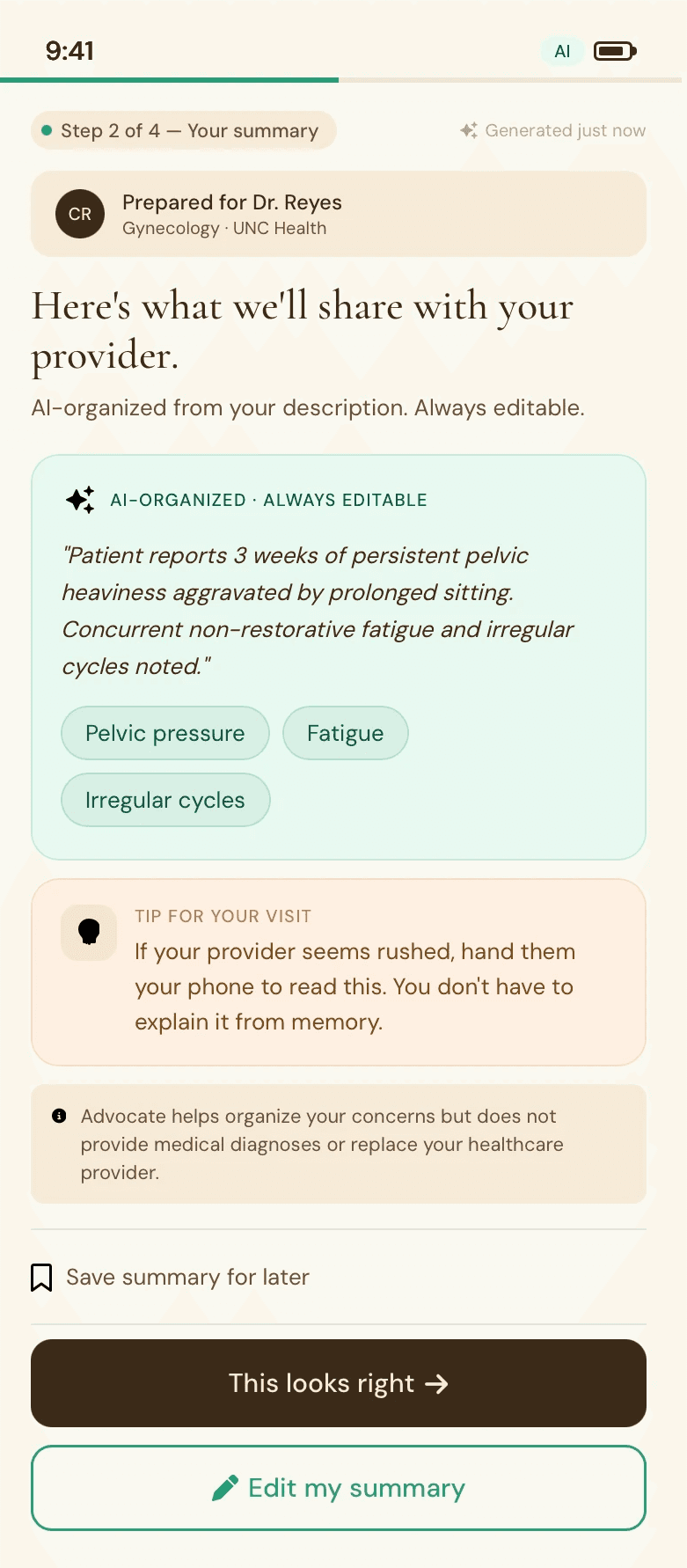
02/ The AI summary felt most trustworthy as an organizer, not a diagnoser
Insight: Participants trusted the AI feature more when it felt organizational rather than clinical.
Design Response: All AI-generated content is labeled “always editable” with an explicit non-diagnostic disclaimer.
03/ Some participants preferred softer advocacy language
Insight: One participant preferred, “Before we move forward, I’d appreciate the opportunity to ask a few questions.”
Design Response: Future iterations may need adjustable tone options depending on personality and provider relationship.
How might we help Black women feel more prepared and confident before medical appointments?
Rather than redesigning healthcare itself, I focused on improving one part of the experience that users could control: preparing for conversations with healthcare providers.
How Might We?
01 / UNDERSTAND
Research method
Online discussions from Reddit communities (r/BlackLadies, r/PCOS, women’s health discussions) were reviewed to identify recurring themes, a social listening exercise, not primary interviews.
Common themes identified
Feeling dismissed, delayed diagnoses, emotional burnout from self-advocacy, lack of representation in medical visuals, communication barriers during appointments.

Persona
User needs
Emotional
Feel heard, feel confident, reduce anxiety.
Accessibility
Inclusive visuals, plain language, mobile-first.
Functional
Symptom tracking, plain-language explanations, appointment prep.

02 / DESIGN
Four core screens support the appointment-prep flow, shown here as a working walkthrough.

Prep Dashboard
Shows the upcoming appointment and a 4-step progress tracker. Breaks prep into named, completable steps rather than one intimidating task.
AI Summary
Converts logged symptoms into a plain-language summary, tagged ‘AI-organized, always editable.’ Feedback showed this framing felt more trustworthy than a diagnostic one.
Questions to Ask
Generates symptom-specific questions with copy, regenerate, and add-your-own controls. Gives users concrete language to bring into the room.
Advocacy Script
Word-for-word phrases for three scenarios: pain being minimized, being rushed, wanting a second opinion. The feature participants responded to most emotionally.